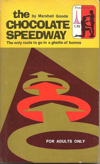
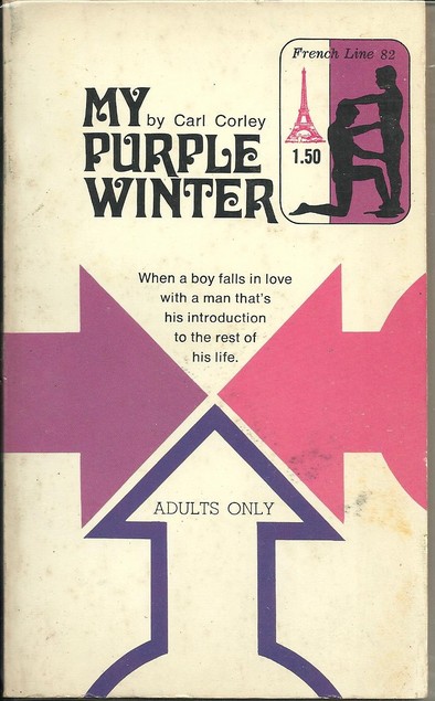
My recent introduction to Don Kelly's collection on Library Thing has enabled me to write a post I've been hoping to do for months. French Line was one of a number of paperback imprints from the 60s and 70s offering pulp erotica and this imprint in particular was known for its gay titles. Actually, for books which are supposedly for a gay audience, many of the titles and straplines bordered on the homophobic (The Chocolate Speedway, the only route to go in a ghetto of homos : The Fag Chaser, how long does it take to make a straight guy gay : The Reamers, now listen here boy, when I say 'on your knees' I don't mean pray) and even if those have an element of black humour, it's hard to not see Homo Horror as something of a lapse in judgement: 'an island of ex-Nazis replay the Concentration Camp game'! So why am I remarking on them at all? It's all in the cover of course. This is something I noticed a while ago but haven't been able to illustrate it with decent images until Don Kelly's collection appeared on my horizon.
French Line, like many other imprints had a whole range of poorly drawn covers that featured somewhat awkward or cheesy pencil drawings or paintings of hunky young men in suggestive poses but French Line, uniquely, also seems to have had someone working for them who had a real eye for cover design and among their titles are ones like these pictured here in which the graphic element is very strong and often involving the Male gender symbol, silhouetted figures and strong colour work. Some are almost reminiscent of 1960s Pelican/Penguin covers. I have no idea who the designer was but I would be surprised if all the covers featured here weren't created by the same person.


